Safety in Numbers

Not a very long long time ago, the realm of education was consumed by a persistent concern over what it didn’t know. The yearning for a complete picture, a comprehensive understanding of students and their progress, drove the relentless pursuit of data. However, in this age of information abundance, a new challenge has emerged. Education now finds itself facing a different dilemma—not a scarcity of data, but an overwhelming surplus. More data, more systems, more analysis have flooded the educational landscape, promising insights and answers. Yet, amidst this sea of information, clarity and thoughtful interpretation can often become elusive. The allure of ‘safety in numbers’ beckons, but we must tread carefully, lest we become entangled in the web of data overload, losing sight of the true purpose: using data effectively to drive meaningful change. As we navigate this landscape, the concept of ‘safety in numbers’ takes on a different meaning—one that calls for discernment and focus rather than being carried away by the sheer volume of information.

Collecting data has become second nature from assessments to behaviour, the systems for data collection have grown exponentially. The prevailing belief is that more data leads to greater understanding and better decision-making. However, amidst this relentless pursuit of data, one critical aspect often gets neglected—the need for meaningful reflection and analysis. It’s not just about collecting data once and using it many times; it’s about collecting data once, thinking about it properly at least once, and using it to help inform discussion in a meaningful way.

Teachers, at the heart of the classroom, possess a wealth of knowledge and experience that cannot be replaced by any data collection system. They understand their students in ways no data point can capture. Sometimes danger lies in relying solely on data to shape our perceptions and decisions. Data should serve as a tool to enhance our understanding, complementing the insights gained through personal connections with students. It should not overshadow the importance of human judgment, intuition, and empathy that teachers bring to their classrooms.

Amidst the abundance of data and the myriad of systems designed to display it in a thousand different ways, the risk of losing focus and direction is real. Schools may find themselves drowning in an ocean of numbers, struggling to discern the signal from the noise. While data can highlight trends and patterns, it is the actions we take that truly make a difference. Merely being surrounded by data does not equate to using it effectively.

As schools continue to navigate the complexities of data usage, it is paramount to strike a balance between quantity and quality, between being overwhelmed by data overload and using data purposefully. The allure of “safety in numbers” can lead us astray if we fail to focus on actions rather than distractions. By collecting data once, thinking about it properly, and valuing the unparalleled knowledge of teachers, schools can transform the overwhelming array of data into a catalyst for positive change. Let us embrace the power of data without succumbing to its overwhelming presence, using it as a compass to navigate the path towards improved student outcomes. By keeping our focus on what truly matters—the growth and success of students—we can harness the potential of data and wield it as a force for meaningful transformation in education.

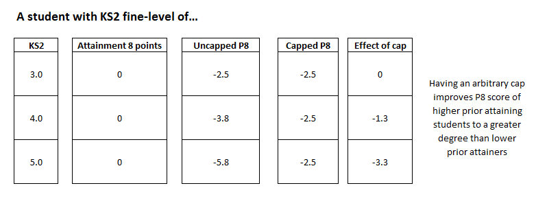
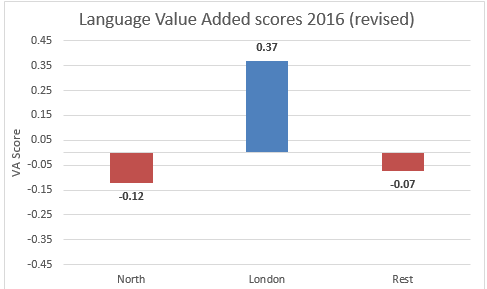
I believe that this framing of data is vital as we head towards yet another period of turbulence in secondary data, as we will shortly no longer have progress 8 (due to lack of starting points) and obviously therefore KS2 outcomes as a crutch on which to lean and to use as the basis of discussion. One option would be to try and replace that information with something similar from another source, and many schools will attempt just that, however energy could be better served by not investing in more made-up information and instead focusing more on what differences can be made to tangibly help students in the here and now. In short, revisit your mindset and not your dataset.

And perhaps… in my version of this fairy tale – we’ll all live happily ever after.

Despair-school-performance

I recently wrote about why the proposed publication of the performance tables for student sitting exams this summer makes a mockery of any sense of fairness, comparable accountability and the ability to inform parental choice:

As I explained in that blog, it’s not about about the decisions made, although they could be better thought out – as I will explain below – but rather it is simply about the decision to publish performance tables in full with all the usual measures, in hugely unusual times.

In seems incredibly logical to me that if you are having something called “Compare School Performance” that any comparison needs to be as fair as possible.

The Updated DfE guidance sets out some examples of what the changes mean for the headline performance measures, including attainment 8 which of course feeds progress 8. There are a couple of handy examples of what this all means:

So in a usual year, Poppy would score 67 attainment 8 points. Lovely. Let’s see what’s happening this summer:

As the DfE text explains the English Literature is not counted at all, apart from to double weight the English Literature. The upshot of this is that Poppy now has 64 attainment 8 points.

67 or 64 attainment 8 points doesn’t sound like a great difference does it? Believe me, it is.

It’s fair to assume that any decision to enter early for as in the example, English Literature is often a whole school decision. Not always. But typically this sort of decision affects the whole cohort. Therefore across a whole cohort achieving the same as Poppy, and these rules being applied, and the students attaining 3 fewer attainment 8 points:

This would mean that the school Progress 8 figure would be -0.30 compared to a year where the usual rules are applied. This means if you are achieving P8 of +0.10, you are now coming out with -0.20. This is possibly moving your confidence interval below 0 and therefore give you a “below average” label instead of “average”.

On the flip side, for all the schools that don’t have any early entry, because Progress 8 is a zero sum game, i.e. reductions in some schools scores must be balanced out with gains for others – then all these schools will do a little bit better.

It’s a bit like a football league table showing positions and points scores but not telling you that some teams have played 46 games and some have only played 40. And guess what, some teams are getting relegated on this basis. Doesn’t sound all that fair. Plus there’s an influx of new fans who are looking to support a team for next season and they also have got no idea who played what amount of games.

So, just to be absolutely clear, I’m also not saying that the usual way of calculation should be used, because that would mix TAGs and Exam Results and that just wouldn’t be fair either, in the other direction.

What could happen?

Option A – The affect of not including English Literature (in the DfE example) could be tempered by allowing English Language to count in the English basket but also in the Open basket.

This would soften the blow slightly. It’s not ideal though.

Option B – If any grades are excluded from the attainment 8 calculations then they are replaced in the calculations by the average of the other counting grades. In the DfE example this is also 6 and would have the same affect – making the attainment 8 score 65.

What should happen?

The above options don’t really cut it. The only true solution is not to publish measures that are affected by early entry. It’s that simple. You can’t have zero-sum measures when the field is not even pretending to be level. You can’t really have threshold measures either although they are less problematic. Why can’t the performance tables simply be a list of subjects and the grades, or grade percentages with suppression for low entries. No comparisions, no faux measures masquerading as real information. Just some raw information and a link to the schools website, where they can make their own case.

We need less data-science and more conscience!

Progress is dead, long live progress!

Yesterday, the Government made a small but significant announcement about KS4 accountability measures in 2022.

In their update they rightly talk about recognising “the uneven impact on schools and colleges of the pandemic”. However, they still plan to publish performance tables with as much normality as they possibly can.

The Progress 8 measure in particular, is most sensitive to small nuances in education, and the effect of pandemic is varied and wide ranging both between schools and within schools. Whilst, I can see the argument that as there has been two years now without public information being made available to parents, this does not mean that we should hotfoot everything back into the public domain as soon as possible. I would suggest it would be prudent for our data decision makers at the DfE to be less preoccupied with whether they could and take more time to consider whether they should. The decisions made in this announcement are going to have T-Rex sized implications for many teachers and school leaders that are simply out of their control.

So, there are obvious problems with publishing a progress measure that relies upon the education machine working as smoothly and consistently as possible, in a time when schools have all had to face huge hurdles in terms of getting students to school, offering online learning and so forth. Based on this alone, there is no way that the measure is going to point to real variation between schools. Possibly, and at best, there could be a small chance that it could indicate the variation in responding to a pandemic.

Anyway, and aside from all this, the Government update adds more imbalances to an already uneven situation.

DfE:

“When calculating KS4 performance measures in 2021/22, we will count entries from 2019/20 and 2020/21, but will only include results from 2021/22”.

Essentially this means that for example in English, if only one result came via exams this year, it would still get doubled in the Progress 8 measure, but wouldn’t count in any other way. This will leave some schools short of 8 qualifications for students, especially in the open basket and this will have a big impact in some schools and slight impact in some and no impact in others.

The Government are really stuck between a rock and a hard place with this. Whether they allow or disallow results from early entries to count it either favours or disadvantages the schools that do that. Therefore instead of arguing the merits, or otherwise of early entries, it is much more clear cut to simply say that any affected performance measure as stands cannot work in 2022. The schools with early entries, were committed to that method of delivering the courses before the pandemic came along, they had made commitments and promises to both students and parents, it’s simply unfair really to penalise them in the measure by not including the results.

Progress 8 is dead:

Due to the ongoing impact of the pandemic – Progress 8 as a measure does not work very well for at least 3 out of the next 5 years and even the years it could work in are dubious. The next cohort that Progress 8 has a real chance of being a reasonable measure for is in 2027!

Cohort of 2022: It does not work as a measure of school performance for the reasons I’ve mentioned above.

Cohort of 2023: It might work, but if we assume that in 2023 schools who have early entries in 2022 the same disallowing of those results occurs (because the exam season this year is subject to special rules like more lenient grade boundaries and so forth), then it doesn’t work. Furthermore, there will be no way for schools to use the 2022 data to even begin to project their outcomes for 2023 due to the special nature of the 2022 exam season.

Cohort of 2024: It might work, depending on what happens in 2023. Also schools could have a chance of being able to use the 2023 data to inform this year group in a meaningful way.

Cohort of 2025: It does not work because the students do not have any KS2 starting points.

Cohort of 2026: It does not work because the students do not have any KS2 starting points.

There are also added complications with the change to scaled scores as the starting input and how they translate to outcomes and also difficulties in how those tests have been evolving over time.

Anyway, this seems like a long time and a lot of hassle for minimal gain and zero insight into anything, so why not just save all this anguish and like a sandwich with no filling that’s been out in the sun too long, just pop it in the bin now? Don’t think about putting it in the fridge. It’s not going to be any better tomorrow.

Long Live Progress:

Despite all the issues with the current measures, I do feel that education needs progress as a concept. Moving to a raft of attainment measures only would be a retrograde step in my opinion. I like the concept of any school can be a great school, and we can have the data to help aid our understanding. However, liking all these things and having appropriate, fit for purpose measures to describe them is another thing.

Certainly if you were asking me, especially in this pandemic hit year, the most important things remains to ensure that students can make their next steps. We need to inform choice but we don’t want to misinform based on a selection of measures that don’t fit the situation. Therefore I would suggest allowing any schools that feel the performance measures are inappropriate for their situation in 2022, whether that be due to the measures being skewed by early entries, excessive absences, or whatever… to simply opt out of them either partially or in full.

Schools could select from a bunch of statements that best fit their situation i.e.:

“Due to entries made for the cohort during the pandemic, this measure is not published” Please visit our website at …….. to get further information.

Or something like that. I don’t know – I haven’t thought it through. Sound familliar?

Grading Summer 2021

Summer 2020, was for many – a fiasco. I’m not sure many of us want to go there again; the uncertainty, the disbelief, the lack of clarity, the algorithm, the dissatisfaction. It was a unique situation, thrust upon everybody with little preparation.

Summer 2021, in theory, should be a different kettle of fish. Lessons should have been learnt from last year and plans should be well in place to deliver results to students who have been adversely affected through no fault of their own. However the lack of confidence that the organisations in charge appear to have in themselves and the system does concern me. We’ve had a few leaks about what Summer 2021 might entail, but really we need to see the detail of the plans to fully understand what is required, by who, how and when. This will be announced this week, however how confident can we be that these will be the full and final decisions and that they will not change?

A plan:

I believe that the grading approach should take two forms:

Firstly – Every student should be offered the chance to sit a full exam in any subject that they have been studying. This would be the student’s choice. For some students this will be the path that they want to take, they have spent a great deal of time, learning, understanding, being tested and testing themselves. They want to take exams, they should not be denied that opportunity. Some students might choose to sit a full suite of exams, whilst some may only choose to take a few exams, ones that they are interested in, or wish to continue study in. As I said this will be the students choice. They don’t want to just sit a mini-exam and have the teacher/centre assessment. They’ve geared themselves up to run a 1500m race and they don’t want to be judged solely over a 200m sprint.

Secondly – Not every student will want to, or will be in a fair position to feel that they can sit an exam. This is why, every student should also be centre assessed. Like last year, with some sensible caveats around rampant grade inflation. Students who choose to sit exams will also be centre-assessed. Everyone will be assessed in this way.

Certification – Every student will receive certificates, the certificates will be similar. For those students who sat an exam, the certificate might say “exam graded in X subject at Grade: Y”, the other certificate might say “assessed in X subject at Grade: Y”. Students can choose which grades they carry forward, put on applications / CVs etc etc.

This would be the solution I would put forward, sure there may be some logistical difficulties, but I believe these could be overcome. I think the solution is satisfactory to all, including private candidates who might only have the option to take “the exam route”. Exam boards would have marking to arrange, appeals to administer, like in a normal year.

Accuracy of predictions: Research

Hello,

I have long been interested in accuracy of predictions because I do believe that predicted grades are best for working with in KS4 in schools because they give a consistent picture of where students are predicted to end up. The current grade or working at grade is harder to apply consistently across subjects. Predicted grades also lead to a greater comparability of the whole school measures.

Nonetheless, predicted grades are only useful if they are as accurate as can be. This piece is not really discussing how that accuracy can be improved, although I do believe that the proportion of predicted grades within 1 grade can be improved.

This is just a research piece that I would like to put together, to see how accurate final predicted grades were last year compared to outcomes. Let me be clear that there is going to be no analysis of this at a school level or anything like that, this is just to get a sense of the national accuracy using the biggest sample of data I can gather. I think the accuracy of grades being correct lies at around 55% but it could be 5% either way. This research will help us to see that figure and national subject variation and variation based on a few student factors.

So to achieve this I have devised a template in Excel.  CLICK HERE to download.

There are instructions within the file of what to do and where to send it back to, it shouldn’t be to onerous I hope and please don’t worry about it.

The file also gives you – as a thankyou – some analysis of the data that you put in. For you.

I hope to collate and share some details of the analysis later this week.

I will also provide the collated file of all the returns sent to me as a publicly downloadable file so people can investigate thing themselves. Should they wish.

Everything is / will be / anonymous.

Click link and then the download button to get the template.

Many Thanks,

Peter.

forecast

Progress 8 and ECDL

The explosion of the ECDL qualification throughout 2016 and 2017 has been well documented before by myself and elsewhere. It is also common knowledge that students were able to gain much higher grades and in a shorter timeframe than other approved qualifications.

“In the European Computer Driving Licence (ECDL) qualification, which has drawn criticism recently, the difference is staggering. On average, pupils taking the ECDL achieve 52 points – equivalent to a grade A – whereas they average 38 points – below grade C – in their GCSEs.” (Edudatalab, May 2016)

However, this isn’t to say that the qualification itself was a bad thing, indeed for some students it provided important recognition of their competence in Microsoft Office packages that could then be used to progress to another course or help them access employment.

Some schools were evidently using the qualification in this way, whereas others it would have to be questioned whether they were entering the whole cohort in order to mask the progress made in other subjects in the overall Progress 8 (P8) score.

Indeed 2240 schools used the ECDL (or close equivalent) in some form in 2017.

Of these schools, 880 used ECDL for less than 25% of their cohort, whilst 626 entered 75% or more of their students into the qualification. The average ECDL entry percentage of schools that offered ECDL was 45%.

209 schools entered over 95% of their cohort into the qualification.

On average the schools with over 95% of entries achieved a progress 8 score of +0.23

ecdl2017

It’s a fair assumption to say that on average the overall P8 score for these schools was driven disproportionately by the Open Element, which is where the ECDL qualification falls.

However within these 209 schools it is evident that some blanket ECDL use was not complicit in them achieving a strong Progress 8 score: Take this school for example:

ecdl2017A

Here we see that the Open Element is the strongest Element but the overall P8 score would be very strong anyway so entering all the cohort for ECDL has possibly made marginal difference to the P8 score but it would have remained in a very strong position anyway.

In contrast, the school shown by the data below has achieved a positive P8 score, solely because of it’s outcomes in the Open Element of Progress 8:

ecdl2017b

Clearly, without the Open Element (of which ECDL makes up a maximum of a third) this school would have achieved a much lower overall progress 8 outcome. Now of course it is not for me to say that this wasn’t the right course of action for this school in order to deliver the best set of qualifications for it’s students. I am simply pointing out how the P8 score is a balance between several subjects and it is up to others to decide whether that balance represents a good level of education, or not.

For those interested, the top school here is judged Outstanding at the time of writing and the second school; Good.

I should, as ever, place a reminder that progress 8 is a zero-sum measure, which means gains in one area, must be offset elsewhere, that is the nature of the beast.

Ofsted of course remain clear that no single measure can ever be used to form a judgement of a school, which is entirely sensible, and they seem keen to get to the bottom of curriculum mix and qualifications offered in schools and to what purpose they are occurring.


1, Data Source: https://www.compare-school-performance.service.gov.uk
 
 2, Throughout this piece I referent to ECDL, the data actually refers to to ECDL or equivalent qualifications and by equivalent I mean qualifications with the discount code CN1 that are VRQ2s and carry a D*, D, M, P grade structure.


Who’s gaming who?

Sometimes I do wonder whether schools are gaming the performance measures or whether the performance measures are gaming the schools.

There’s already a raft of nuances in the performance table measures that marginally move the data one way or the other.

Firstly, the KS2 fine-level cap at 5.8 means that students who have a higher starting point than that are effectively lumped in with everyone else at 5.8. The reason for this is that the use of the level 6 KS2 tests varies between schools, but it has the side effect of giving the students with the highest prior attainment a slightly less challenging attainment 8 estimate.

Secondly, the attainment 8 figures this year are going to be hugely affected by the meddling with points scores for legacy GCSE qualifications. In short, a school with students who all attained A grades last year and this year, would receive the same attainment 8 score in both years. However a school with C grade students this year and last year would receive a much lower attainment 8 score. Although actual achievements are the same. What is the likelihood that these statistics will be put forward for the Grammar school argument?

Finally,  I’ve read this week that in order to solve the problem of one outlier being able to effect the progress 8 score of a school, that a cap could be introduced of -2.5 or +2.5 for each pupil. This would reduce the impact of outliers on the school score.

However such an arbitrary cap would penalise schools with intakes of lower prior attainment and conversely favour those with higher prior attainment.

cap.PNG

So as can be seen, introducing an across the board cap on those students achieving nothing, benefits schools with higher prior attainers, in that it reduces this impact on those schools to a greater degree.

Furthermore, what sort of message does a cap send out?, basically that for a level 5.0, the first 33 attainment points they achieve count for very little. This means schools could be encouraged to not persevere with the student projected to achieve 10 A8 points because unless they get to 33 points it makes no difference to the school. Whereas in the uncapped system, improving that students grades does carry an incentive.

Other solutions could be…

…to report on a typical P8 score for schools, which perhaps looks at the middle 90% of P8 scores, although again that could carry perverse incentives.

… to introduce a cap that slides with starting points, so that the cap for a lower prior attainer could be -1.0, whereas a higher attainer might be -3.0. This would work on some sort of statistical link between A8 estimate and where the cap sits.

…to leave it alone.

Whatever the powers that be decide, I hope they consider the unintended consequences of their well-meaning actions.


Parlez-vous Progress

Alongside the DfE school performance tables which were published last week, comes a statistical first release that covers a wealth of interesting national, regional and local data.

https://www.gov.uk/government/statistics/revised-gcse-and-equivalent-results-in-england-2015-to-2016

The tables contained within in this link tell us a lot of useful information, but in the hubbub that focuses on school achievements at this time, sometimes interesting messages can be missed.

One that fascinates me, and has for a long time is the strong performance of schools in London compared to their counterparts across the country. This is not a new phenomenon and has been reported on several times in recent years, in pieces such as this, this  and this.

However of course, this year, we have a new progress measure on the block (progress 8) and it is interesting to see how London fares here compared to other areas.

In order to streamline this analysis, I have categorised the DfE regions like so:

lnr

In brief, London hugely outperforms these areas on the Progress 8 (P8) measure. London achieves a P8 score of +0.16, whilst the North lags way behind with a score of -0.11. The rest of the country scores -0.03.

chart1

Progress 8 can be broken down into “elements” that contribute to the overall score, the area where London performs strongests is in the Ebacc element, the Ebacc element contains academic subjects in the curriculum areas of science, humanities, languages and computer science.

chart2

So this really appears to be a London / North divide. So again we should dig a bit deeper… as I mention above, the Ebacc element comprises of sciences, humanities and languages.

When we investigate these three components, it is languages that comes out with the greatest disparity:

chart3

London massively outperforms the other areas in terms of progress made in languages, and in fact when we break this down to school level, we can see that 75% of schools in London make positive value added in languages, compared to just 45% in other areas.

This was the end of my original blog, however I was inundated with people hypothesising that these patterns shown above were due to students entering GCSEs in their home languages. With London having a more diverse population, this had greatest impact on Language value added scores in London.

It is a sensible hypothesis, but not all that easy to investigate with the data we are given.

However what we can say with certainty is that across the country students with lower prior attainment at Key Stage 2 (KS2) achieve higher grades on average than students in other Ebacc areas:

langva

As we can see, students with the lowest prior attainment at KS2 attained much higher on average in languages than students with similar levels of prior attainment in science or humanities. (English and maths also a lot lower on average). Of course it is worth noting that the KS2 fine levels in 2016 are derived from an average of English and maths and therefore take no account for ability in languages, or science or humanities for that matter.

It is a fact that in 2016, students with lower levels of prior attainment as measured by KS2 outcomes in English and maths achieved, on average, much higher grades in languages than in other subjects. 

OK, so these students, achieving great things in languages… it might be fair to ask, whether the languages they are achieving good grades in are ones that the schools have painstakingly taught them, or whether they are taking examinations in languages that they already speak at home or in the community.

There’s no way to tell from the national data that is publicly available. However what we can tell is the proportion of students that are EAL (have English as an Additional Language) in a school. Then we can look at the value-added scores for those schools in languages:

lang-va

So as might be expected, progress in languages is much greater in schools where greater proportions of students potentially speak multiple languages.

How does this translate to our regions?

prop

London has proportionally more schools than the rest of England that have 50% or greater of their students with EAL.

Is there regional variation in school outcomes between schools with large proportions of EAL?

varegion

Some variation exists between the North and London.

In summary, schools with greater proportions of students with EAL make more progress in languages. These schools are concentrated in London. Therefore Language Value Added scores are higher in London than in other regions. Languages form an important component in both Progress 8 and the Ebacc measure. Therefore this should be taken into account when considering the relative performance of schools in Languages, and possibly depending on which subject mix has been taught in schools, in general.

Interactive RAISE – 5 reports

Hello,

A brief blog to give my thoughts on 5 RAISE online interactive reports that are worth looking at straight away. I’m not saying the other reports aren’t worth it.. .but I think these are to good to look at first as a starting point.

How do  I get to them?

Log on to RAISEOnline: https://www.raiseonline.org/

Click on Reports, then Key Stage 4.

I’ve highlighted the reports below:

raise

OK… some important things to note, as highlighted by the stars

KS4.P8 – when you open this report you might think, umm that’s nice, but when you go to Options – Progress Related it takes the report to another level. A much more relevant and useful level… do it.

raise1

KS4.Thresh – the eagle eyed amongst you will have noticed I’ve only highlighted 4 reports above… but I said 5 reports. Well I think it is useful to cut the KS4.Thresh report both ways. As standard the report opens and it is comparing you to the specified national comparator. This is fine… and correct… I’m seeing a lot of comments saying this report is incorrect.

Actually, it’s not correct, you need to read the column titled ‘Natioanl comparator type’ and then understand that the national data shown relates to that group. This is as identified in the statement of intent that it is better to compare school figures to the national figure for the comparator group, as this avoids the issue of gaps appearing to narrow or widen based on school overall performance.

Does that make sense? Anyway, if you wish to see it the other way, i.e. comparing like with like, again choose Options – Same. This is useful, but not how schools should be judging themselves on narrowing the gap. Use the specified report for that.

Finally the two subject level reports I’ve highlighted above are useful, as they are.

Progress Reyt*

*Reyt is a Yorkshire persons way of saying “right” or “really” sometimes they might say “reet” or in some areas they say “rare”. Anyway I’m using “reyt” as it rhymes with “eight”, I barely feel the play on words is worthy of the explanation but… I aim for clarity.

So what I am trying to say is Progress Right, or Getting Progress Eight Right.

On 26th September this year schools got their first glimpse of their provisional progress 8 score for the results of the 2016 cohort. There was considerable consternation in some schools due to the figure being considerably lower than what they had calculated in their MIS or analysis system from results day. This was entirely to be expected, as I’ve said before, have a handle on your P8 scores using previous years estimates, but don’t publish them, and certainly don’t shout them from the rooftops.

So most schools saw their provisional progress 8 score ‘drop’ by between 0.1 and 0.2 depending on the proportion of students with lower levels of prior attainment in the cohort due to the increase in entries to Ebacc subjects (see edudatalab post here).

So although the overall headline figure was ‘wrong’ as would have been calculated in year, and on results day, lots of your thinking if you were using progress 8 would have been right.

For example, the table below shows how GCSE subjects in my school fared before and after switching the estimates from the best national attainment 8 estimate of 2014 and 2015 to the 2016 estimates.

I just need to stress, that we don’t rank subjects in this way, I am just using it as a device to show that irrespective of the which P8 estimates we use the subjects are in a similar order. Therefore… in year when we are working with these estimates and scores we are supporting and asking relevant questions of relevant areas at internal assessment points.

sbjs

N.B. P1 just means progress 1, which is what we call progress in a single subject.

Equally, when we talk about individual students and look to support or challenge individuals, review options and such like, you can see from the chart below that again, irrespective of which set of estimates we were using or should have been using that we would have had a good idea of which students were making least and most progress.

linesrank

Again we do not rank students like this. It is for illustrative purposes.

Students of course fit into groups, so again if we were looking at groups, or gaps we can be fairly confident we are looking at the right sort of things.

In conclusion, I believe that using progress 8 methodology on your current cohorts is OK, certainly better than using a methodology based around thresholds or in my opinion than doing nothing at all.

So after all, it’s not about getting the Progress 8 headline, the flashing and dancing school score right, it’s about using the methodology in the right way, thinking about what it does tell you in the right way, and supporting your students and teachers in whatever way you feel is the right way.

Reyt?